# Typeface and Fonts in Map Design
Both terms (typeface & font) are commonly misused, but in literature and on the web, it seems, that people do not make a distinction between them. Typeface is a set of letters and numbers (glyphs) with a unique appearance, e.g. Arial or Times New Roman. Font describes the styling parameters of a typeface, e.g. Arial 10pt bold.
Apart from color an important map design component is text: labels, title and legend entries. As with every layout decision create a certain mood and impression on the overall map, so it needs to be kept in mind what font is suited the best for the purpose.
Table of Contents
# Type personality
“Fonts are the personality of a map. They may be serious and authoritative or carefree and inviting. Whatever their tone, they need to be legible in the challenging contexts that are characteristic of mapping.” (Brewer 2016, p. 86).
With this quote C. Brewer may be hinting at the type personality. The term was introduced claiming that a typeface can create a certain mood and attitude. Without it, maps are as simple and powerless as pictures. A designer and cartographer should have basic understanding about how a typeface can affect a map and how to make the most of the map design. The purposes of text on a map are:
- to label
- to explain
- to direct or point
- to establish hierarchy or show size
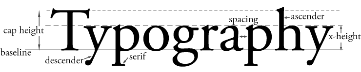
# x-Height in Typography
The figure below gives an overview of the general terms in typography, as they shape the typeface and are included into the font styling. Regarding web maps it should be pointed out that spacious x-heights, letter spacing, and consistent thickness work best for maps viewed on a screen. Often, the map type is small. Thus, map makers use fonts with large x-heights.
TIP
Inter (opens new window) is an open-source font family designed for computer screens guaranteeing a tall x-height.
# Typeface Combinations
Traditionally, serifed fonts are mostly used for body texts, which have more than one sentence, and are read at close range. Serif type connotes tradition, dignity and solidity. Sans-serif on the other hand are used for wideranged reading and short texts, such as titles and implies newness, precision and authority.
A map should include few fonts, traditionally being one serif and sans-serif font family. Combinations of two sans-serif or two serif fonts should be avoided. When choosing the two fonts it should be ensured, that they complement each other, e.g. both be informal or modern. Some fonts are designed to be used together, e.g. Stone Sans and Stone Serif or Cambria and Calibri.
There are various sources on the Internet (see tools list below) which show a complementing pairing of fonts. Google Fonts (opens new window), for example, always suggests popular pairings when looking up a typeface and offering live examples on how the composition works.
So called *Superfamilies are font families that were created to work together in harmony. These are designed to guarantee visual closeness and balance. Examples are Noto & Noto Sans, Quattracento & Quattracento Sans or Roboto & Roboro Slab / Mono.
When using two fonts consider what it is applied on. Natural Features, e.g. hydrographic and physical landmarks, are typically labeled by serif fonts. Contrary, sans-serif fonts describe cultural features. Nevertheless, using only a single font should be preferred altogether, if possible.
See Font Pair Collection for suggestions and examples.
# Font styles for certain purposes
Font styles and differing properties should symbolize certain characteristics. A type can be used on a map to differentiate qualities as well as quantities and hierarchy or both, see fig. above. Various typefaces are usable for qualitative characteristics of the data. Additionally, type color hues imply different nominal properties of the object group.
Font size changes within the map indicate quantitative dimensions of a feature, e.g. big fonts representing continent names while small fonts label villages. To achieve a noticeable difference of font sizes, a 3 point difference should be used for medium and larger font sizes and simultaneously a 2 point difference for small size fonts, but type sizes of less than 10 point are hard to read on screens.
Font weight also implies quantitative characteristics. Bold type signifies importance and makes texts with less saturation, such as grey text, more legible, but may create a plump look.
Capitulatory, a list these important requirements of letter types on maps:
- Differentiation of importance: they should be able to convey a hierarchy between important and less important features, which can be achieved by variations of font weight, size, spacing, color value, and upper-/lowercase style
- Differentiation of categories showing nominal data, which can be set by variations of color value and style
- Usable for all kinds of features (point, line, polygon)
The use of uppercase letters appears often for labels of large features, such as countries, continents or mountain ranges. Less important features remain in mixed-case lettering labels. When using labels with only uppercase letters the developer should be aware of cases where sans-serif types can irritate the user: the word “Illinois” shows a capital I followed by two lowercase l, which can be hard to read when the spacing is too small.
# Legibility enhanced by halos
Resolution can affect the legibility. The typeface should maintain readability when set in coarse resolution or in front of a patterns, as labels spread over different features or get interrupted by lines and colors. A contrasting outline (halo, letter casing) cannot only be used for decorative purposes but also help to achieve a better legibility.
Brewer (2016, p.100) describes the importance precisely: “Halos are best when they are subtle and relatively thin, especially when used for smaller text and unobtrusive breaks, although occasionally a bolder halo may be useful. […] The goal when selecting a halo size is to clean up small pieces of line or other content that show between letters while masking a little of the underlying map information as possible.”.
Regarding the color, the outline should be set in the color of the background or one color of the background pattern, if possible. However, this task can be challenging when many colors are found in the background (e.g. satellite maps). Additionally, regarding the resolution issue, decorative typefaces on the map should be avoided altogether but there are exceptions that a certain decorative font can emphasize the artistic style of a web map.
TIP
Helpful tips by taitmaps.com (opens new window) (currently unavailable):
- Only make halo white / black if background is almost entirely white / black
- Tint halo color to the predominant or average background color
- Soften halo edge by blurring or transparency usage
- Halo should be thick enough to minimize visual vibration
- Use different halo colors for different feature
# Labeling
TODO
This part is under construction! Images coming soon.
# Label Characteristics
- spacing
- capital
- size
- font style
- width
- underline
- color
- font type
- texture
# Label Placement
Placement of text is one of the most important parts in creating a map, because the written information connects the pictorial data for the map reader to decipher. The cartographic task of labelling and text placement requires careful instinct to guarantee quality and aesthetics while it is based on specific rules to guide on. In the further paragraphs an outline of these rules is given to give an orientation on how to label features and when to correct placements.
# Priority
The most important requirement on label placement is that no label overlaps each other or important information from the map features. To find the perfect labelling priorities play an enormous role, meaning, important labels should not be repressed by less important text.
Feature Types
For every feature type – point, line and area – exist different rules each.
# Points
There are different approaches on how to label point objects, in this case Imhof’s (1962, 1975) will be focused on, as it seems to be the most used, as well as Räber & Jenny’s (2001), as I personally like it the most.
Other approaches (in English) are given by:
- Yoeli, P. (1972): The Logic of Automated Map Lettering. Cartographic Journal, 9 (2), S. 99-108.
- Christensen, J., Marks, J. & Shieber, S. (1992): Labeling Point Features on Maps and Diagrams. Report TR-25-92, Harvard Computer Science Group.
Label placements on points should fulfil the following requirements to ensure readability and quality:
- The Text should be horizontal.
- Label should describe the object that is linked to it
- features located at the coast maintain a label in the water
- objects near boundaries maintain their label inside their own territory
- labels should not overlap important map features
- A dense accumulation is to be avoided.
- A neat arrangement is not aesthetically pleasing and should be avoided.
# Lines
- A separation of label and line feature is to be avoided so that the connection between these two intuitively takes place.
- Labels of line are placed alongside the feature itself while avoiding strong curvatures in the text’s path as it can reduce the legibility when letters get bend.
- The placement of the label is favoured above the feature rather than beneath, because a connection between the baseline of the text and the line feature is created and pleasing to the eye.
- Obviously a crossing between label and feature is not wanted.
- If it is a longer feature where one label does not seem sufficient, a second label can be placed in due distance.
# Areas
- The baseline runs along the longitudinal axis of the respective area.
- If possible, the text should be placed horizontally.
- Non-horizontal labels should be slightly curved and extended along the longitudinal axis.
# Ressources
# Download Fonts
- Dafont (opens new window)
- Fontspace (opens new window)
- Font Squirrel (opens new window)
- FontStruct (opens new window)
# Find complementing Font Pairings
- Google Fonts (opens new window)
- Fontjoy (opens new window)
- Font Pair (opens new window)
- Creative Bloq: "33 perfect font pairings" (opens new window)
- Typ.io (opens new window)
Collection of Font Pairs
Have a look at my collection of complementing fonts here.
# Games to train your Font Skills
- Type Connection (opens new window): train your skills of font pairing with this game.
- Kern Type (opens new window): push letters around until a pleasing and readable text is achieved.
- Shape Type (opens new window): drag outlines to create proportionally shaped letters.
- The Rather difficult Font Game (opens new window): identify the fonts used.
- Shoot the Serif (opens new window): An app to have to eliminate the serif characters.
- Type War (opens new window): identify a font by choosing one of two.
# References
- Axis Maps. Labeling and text hierarchy in cartography (opens new window) (accessed 15 Aug 2019).
- Brewer, C. A., 2016. Designing better maps - A guide for GIS users. 2nd Edition ed. Redlands: Esri Press.
- Dent, B. D., Torguson, J. S. & Hodler, T. W., 2009. Cartography - Thematic Map Design. 6th Edition ed. New York: McGraw-Hill.
- Imhof, E., 1962. Die Anordnung der Namen in der Karte. Internationales Jahrbuch für Kartographie, 2, S. 93-129.
- Imhof, E., 1975. Positioning Names on Maps. The American Cartographer, 2 (2), S. 128-144.
- Kraak, M.-J. & Ormeling, F., 2003. Cartography - Visualization of Geospatial Data. 2nd Edition ed. Essex: Pearson Education Limited.
- Krygier, J. & Wood, D., 2016. Making Maps - A visual Guide to Map Design for GIS. 3rd Edition ed. s.l.:Guilford Publications.
- Muehlenhaus, I., 2014. Web Cartography. Boca Raton: CRC Press.
- Peterson, G. N., 2015. GIS Cartography. 2nd Edition ed. Boca Raton: CRC Press.
- Peterson, G. N., 2012. Cartographer's Toolkit - Colours, Typography, Patterns. Fort Collins: PetersonGIS.
- Räber, S. & Jenny B., 2001. Attraktive Webkarten - ein Plädoyer für gute Kartengrafik. Karlsruhe.
- Reiner, N., Hahmann, S. & Kopf, S., 2021. Label Placement Algorithms Avoiding Conflicts For Geographic Information Systems. gis.Science 1 (2021) (p. 9-21): VDE Verlag, Berlin.
- Schüle, W., 1921. Über Namengebung auf geographischen Karten. Grunau, Bern.
- Tyner, J. A., 2010. Principles of Map Design. New York: Guilford Press.?
- Cartographic Visualisation in GIS (opens new window), College of Geoinformatics - University of Hungary. (accessed 10. Jan 2020).