# Map Symbolizations
A map is a complex communication tool and transmit their meaning through symbols. The symbolization of data and features on a map is depending on various factors. The design of a basemap is featured in another section. In this section a collection of symbolzation techniques and considerations are listed to keep in mind when visualizing data.
There is the symbolization for map features that exist in real life called phenomena (e.g. building outline) or make up the base map (e.g. boundary) and there is the design of statistical or geographical data used on thematic maps. Depending on the use case, data structure and map layout, the symbolization is key to bring across the message and purpose of the map.
There is no universal or standardized symbol system established as of now but some principles have caught on internationally. The challenge faced by the cartographer is the multilevel perception to use symbols that a map reader can identify from a legend and determine its spatial relationship.
Based on Visual Variables, certain cartographic principles exist to ensure best readability and understanding.
Table of Contents
# Point Visualization
“Whether a feature is a point or an area depends on the map scale.” (Brewer 2016, p. 180).
In regards of point phenomena starting from a small scale, point features, such as capital cities, become areas as soon as a certain large scale is reached. Geographical phenomena that are commonly represented by point symbols are:
- Population centers: cities, towns, villages, settlements
- Points of interests
- Mountain peaks
- Label placements (of line or area features, such as street or country names)
Point data on the other hand can consist of
# Visual Variables used for Point Symbols
Shape and color are the primarily used variable for point features to distinguish qualitative characteristics. The color filling gives contrast to the surrounding map elements and reinforces legibility. A shape can either be a simple ge-ometric form or more complex in form of icons (also referred as pictograms or glyphs).
Pictograms resemblance features by using shapes that are associated with the object represented, e.g. a plane for airports. They should be easy to identify and distinguishable effortlessly. Consider that not all readers intuitively understand the meaning behind an iconic symbol, even though it may be used commonly on many maps, e.g. tent symbol for campgrounds. Additionally, symbols are evolv-ing: when designing symbols, outdated icons are to avoid, but simultaneously certain cartographic conventions should be maintained. In any case, a legend should provide further information, especially when many symbols are given.
Size is used to build hierarchies or symbolize data values, usually in total numbers. This is especially reasonable when many point symbols of a category are placed on the map; a concept called symbol levels. Combining multiple visual variables can emphasize different meanings, but when symbolizing nominal data, it should be avoided as it can result in creating an order by changing sizes.
If point symbols are overlapping and it must stay conserved, it is advisable to add an outline (halo) to the symbol to prevent confusion.
Often changes regarding the orientation of point symbols are hard to see due to the small size of point features, but there are cases, when orientation can be effectively applied on point symbols: wind or current direction on a meteorological map, temporal data (time of a day) or political orientation (left or right leaning) are some examples.
# Point Symbols marking Position
A point symbol marking a position of an object is used, when it is impossible to give an outline of the object due to scaling or generalization. Geographical figures that are easy to distinguish even with small sizes are suitable for such figures.
Geometric Symbols
Often used geometric shapes are circular disc, circular ring, triangle, rectangle, square, less often pentagon, hexagon and star, but also combinations of lines such as cross are used. This type of symbolization is mainly used to clarify a differentiation, i.e. to distinguish qualities. Different colors highlight related subject groups. If there is a size differentiation, the quantities are designated by different size intervals.
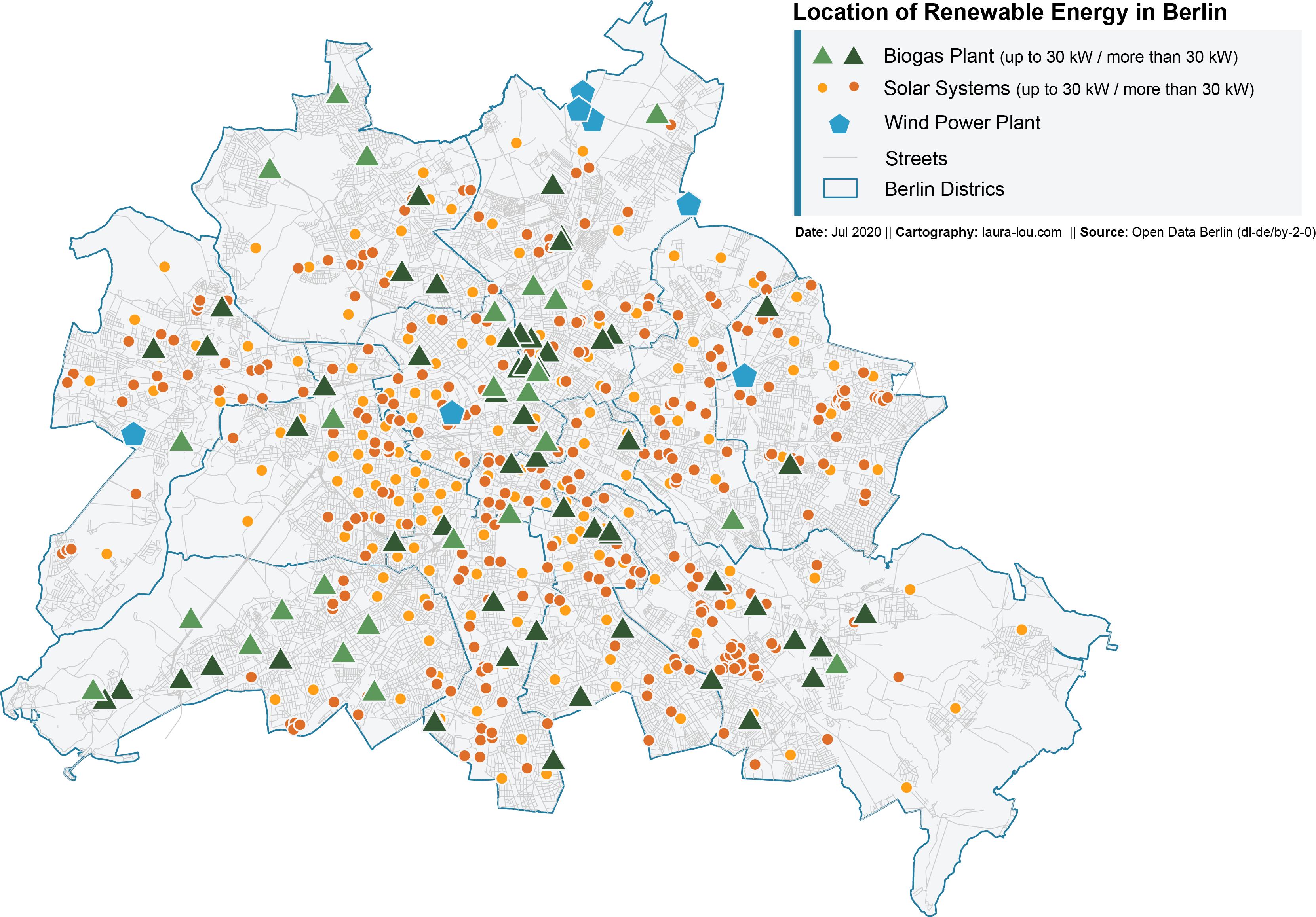
Icon Symbols
Icon symbols, also referred to as figure or pictogram symbols, are small graphical figures, the appearance and partly the color of which represent the object depicted graphically, or are derived directly from its appearance. They are therefore also referred to as pictorial signatures.
Signs are often created from objects that have symbolic value for these objects, for example a retort for the chemical industry or an anchor for shipbuilding. These symbols are mostly understandable without a legend. It should be noted, however, that it is possible to use the same character with different meanings, for example a book for the printing industry and for libraries.
A disadvantage is that symbols can only be graduated in size with great restrictions and that they can be placed much less well at the location than geometric signatures. Color differentiation is also relatively severely limited. The graphic design of symbols can be done with different degrees of abstraction, whereby partly geometric symbols represent the last level of abstraction.
Letter or Number Symbols
Individual letters, letter combinations (abbreviations) and numerals can also individually identify the location of an object on the map.
Their advantage is that letters, in particular, can easily be directly associated with generic names. This is possible through the use of initial letters, abbreviations or chemical symbols. This makes reading the map (decoding) easier, especially when displaying many types of objects at the same time (e.g. mineral resources).
Disadvantages are not always the meaningful signature weight of different letters as well as the limited possibility of size grading, since oversized letters have a disruptive effect on the map. In addition, some letters appear to the viewer subjectively larger than others. For this reason, letters are often used in combination with geometric symbols, in that the letters are often placed in a square or a circle or in that the area is negatively negated in negative.
# Other Forms of Point Symbol Usage
Diagramm method
Because the diagram method refers to a point, there is a need to keep the diagram configuration as small as possible in order to hide as few basemap elements as possible, so as not to destroy the representation of the map and to ensure the legibility of the basemap. However, this means that the display options for the diagrams are severely limited, which in turn affects the reading of the values and leads to the use of simple diagram elements. Column, body, pie and curve diagrams are particularly suitable
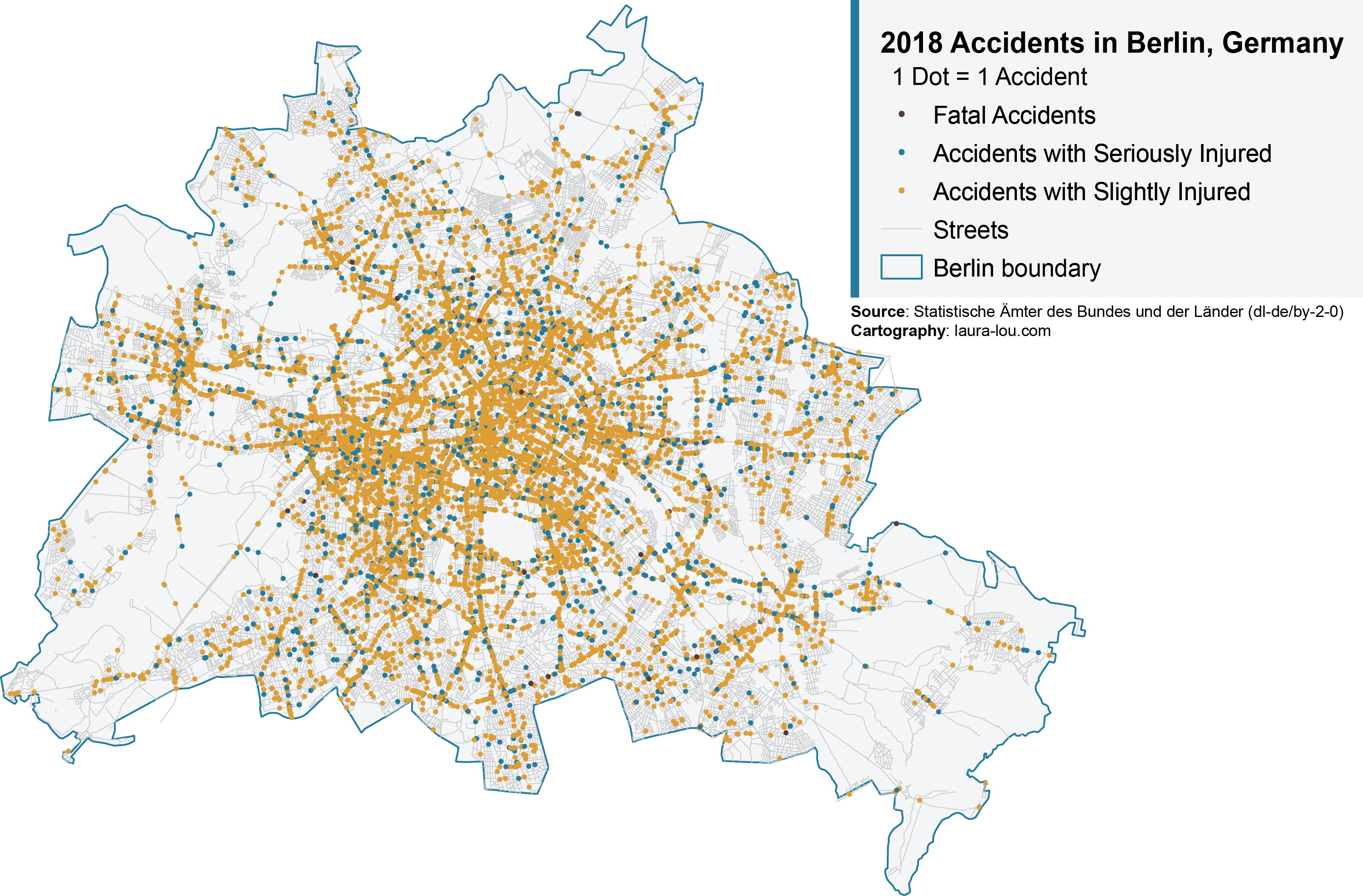
Dot Density
The dot density method is used for the graphical representation of statistical values that relate to an area-distributed mass phenomenon. There is either a schematic distribution of the points within a reference surface or, if possible, an exact distribution of the facts can be recorded with the given point values.
A distinction is made graphically in this symbolization in size, shape and density. The circular disks or quadrants have a size of 0.3 to 1 mm. The individual points embody a defined amount of the object or situation to be displayed. Density is represented by density points or varying point sizes with different point values
# Ressources for Map Markers
# Line Visualization
“Linear phenomena are features that are line-like in reality and may be thought of as having only one significant dimension: length.” (Tyner 2010, p. 134).
Some features can be seen in reality (rivers) others are not concrete objects on the earth’s surface (boundaries). They can also indicate abstract directions such as flow lines of migration direction. In various cases line features can become areas as well depending on the map scale. This applies for example to rivers that appear as line features in small scales but are symbolized as areas in large scales. Features that are symbolized by lines are for example:
- Transportation
- Waterways
- Boundaries
- Utilities
- Elevation and temperature isolines
# Visual Variables used for Line Symbols
In terms of shape, a line symbol varies by changing the form, e.g. solid, dashed, crossed out. This technique creates a pattern by differentiating spacing and length of the dash. With the use of arrangement, the pattern can get more complex.
The size refers to the line width which indicates importance or actual an actual amount of flow data. Orientation may be used to show the direction, such as a road direction. With these variables nominal data and quantitative data can be represented in line features (see fig. ??).
An important cartographic technique used in line symbolization is the casing, which is the equivalent to a halo around a text or point shape. It is formed by giving the line an outline and increases visibility, especially when the line runs over many different backgrounds.
# Lines of Movement
This method is a multifaceted medium of representing the direction and changes in location in relation to a single point object (travel route), scattered objects, linear objects (traffic routes, fronts) or on continuums (wind or sea currents).
The arrow is used as a universal means of expression to illustrate these movements. The width and length of the arrow express the speed or intensity. Qualitative distinctions make up the color or fillings of the object. A scraping of small arrows has an impact on the quantitative appearance. Issues that are embodied by lines of motion include routes, the course of military operations, border relocations, the transport of goods or continuously changing location changes.
# Isoline
Lines of equal value are called isolines. In order to generate such an isoline, there must be mutually close and identical measured values which form a value field in their connection. With this method, quantitative changes in phenomena and facts that consistently exist in one area can be illustrated. For example, temperatures, heights, potentials, flat movements and air pressures are used with the help of isolines. In terms of design, the line is hardly changed. Most of the time, the display only retains a line width and color.
# Area Visualization
Polygon features represent a distributed and defined area which has two dimensions: length and width. Areal phenomena also can be categorized in conceptual and observable features. Examples are:
- Water bodies
- Buildings
- Administrative areas, e.g. states, counties
- Landuse and landcover
- Geology and soil
- Points of interest (large scales)
# Visual Variables used for Area Symbols
The obvious choice of variables for areas are color (value & hue) as well as pattern. The variables shape are not actually used for areal features, as the outline of the polygon represents the corresponding area. However, multiple shapes, combined with differing sizes, can be used to create a pattern and therefore distinguish the features from one another. Forests are often categorized by applying shapes of conifers, leaf trees or both. Size is applied in cartograms.
Additionally, but not ideally, orientation may be used with patterns, to represent differences in kind.
Apart from hue, pattern and orien-tation being used for nominal data, statistical areas are often symbolized by colors or patterns (coarse vs. fine) based on quantitative properties, such as in choropleth maps.
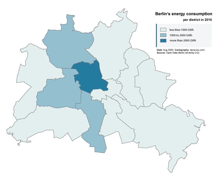
# Choropleth Maps
Cartogram use colors or patterns to embody concrete, quantitative values. The values are projected statistically onto reference surfaces, which then reproduce the density value. The reference of statistical values to an area size corresponds to a real density representation (or also density mosaic), e.g. the population density in inhabitants per km. Statistical mosaics of other real values can cause errors in the interpretation due to extreme size differences of the reference surfaces, e.g. in the proportion of children in a total population.
By analyzing the individual values, value groups can be determined (see Data Classification), which can be graded by color intensity with or without hatching and patterns, which are between three and 15 density levels. However, it should be noted that an increasing intensity of the design feature carries with it an increasing importance of the message.
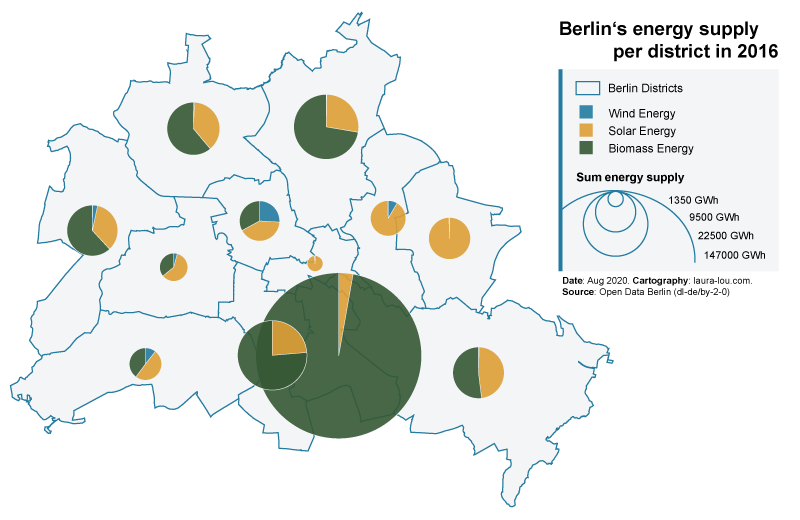
# Map Diagramm
Map diagrams use diagrams of statistical values, which in contrast to the diagram method refer to areas, which is why no statements can be made about individual values. This also applies to the area map diagrams, with the difference that absolute quantitative representations are not possible. It enables two to three different features to be compared easily and quickly in terms of territory.
# References
- Brewer, C. A., 2016. Designing better maps - A guide for GIS users. 2nd Edition ed. Redlands: Esri Press.
- Dent, B. D., Torguson, J. S. & Hodler, T. W., 2009. Cartography - Thematic Map Design. 6th Edition ed. New York: McGraw-Hill.
- Kraak, M.-J. & Ormeling, F., 2003. Cartography - Visualization of Geospatial Data. 2nd Edition ed. Essex: Pearson Education Limited.
- Mastermaps, 2008. Thematic mapping techniques - a summary (opens new window) (accessed 10 Jan 2020).
- Peterson, G.N., 2012. Cartographer's Toolkit. PetersonGIS.
- Roth, Robert, 2017. Visual Variables. 10.1002/9781118786352.wbieg0761.
- Tyner, J. A., 2010. Principles of Map Design. New York: Guilford Press.
- Tyner, J. A., 1992. Introduction to Thematic Cartography. New Jersey: Prentice-Hall Inc.
- UCGIS. CV-08 - Symbolization and the Visual Variables. https://gistbok.ucgis.org/bok-topics/symbolization-and-visual-variables (accessed 14 Aug 2019).