# Color in maps
Selecting colors is one of the most important step when designing a map. There are reasons why color should not be seen as an afterthought in map design but rather as one of the intermediate stages:
- color attracts attention
- color leads the eye
- color affects the perceptibility on the map
- color is part of the visual levels of a map and unifies the design
To choose a color some preliminary considerations are attached. They impact a user psychologically and emotionally based on associations with experiences made in life, personal preferences and cultural influences. The map designer needs to know the meaning of the color, to prompt the desired reaction to a map.
Table of Contents
# Color Connotations
Large online mapping services (e.g. Google, OSM) have similar standardizations in color schemes with slight differences and are known by most users. It is favourable to orient on the existing styles to produce familiarity for the user reducing the need to learn a new set of color references. Intuitive viewing and automatic referencing is what a mapper should aim for. That being said, there are color connotations that most map readers assign unconsciously and should be kept in mind. Most obvious example would be to not assign the color blue to any feature other than water bodies.
On the other hand, color connotations are not universal, meaning colors do not have the same meaning in all parts of the world. Cultural background can assort colors differently than they are assigned purely by symbology. For example, using the color green in thematic maps to symbolize thematic or statistical data, it could stand for positivity, luck and fertility in western culture and death in Latin America, but is mostly recognized as features related to nature.
# Map Purpose
Consider the map purpose or rhetorical appeal of the map to decide if it is necessary to create a wholly new color scheme. If it stands out it certainly attracts attention. Additionally, apart from the purpose of the map keep in mind the environment in which the map is implemented, i.e. is the style corresponding to the web site, the mobile app or operating system? The purpose of the map can be communicated in a more effective way if the design matches that of the surrouding. The so called color echoing by using colors appearing in the map also in elements outside the map ensures that the map is not compete with and instead complemented.
# Color Hue
The logical structure of the data should match the perceptual structure of the color palette, meaning that data sets can be arranged in a sequential, diverging or qualitative way.To ensure readability, colors reflecting the data should not correspond badly to the colors of the map. The human eye can only distinguish between five shades of the same color (hue). This is primarily important regarding quantitative data visualizations, as in choropleth maps, but can also be applied on base maps. Resulting from the previous statement, when categorizing features within a feature class, they should not have more than five divisions.
TIP
Example: The category or feature class is green areas, the feature types are park, forest, nature reserves, national park, etc.
When classifying and visualizing data the color sequences play a huge role in intuitivly percieving the meaning behind. Depending on the nature of the data displayed there are certain types working for the purpose.
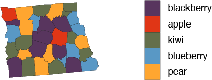
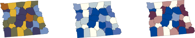
# Qualitative / Nominal
Data categorized uniquely should be displayed in a qualitative way, that means the data cannot be ordered or does not describe numerical data. Various color hues with constant lightness and saturation are the way to go here.
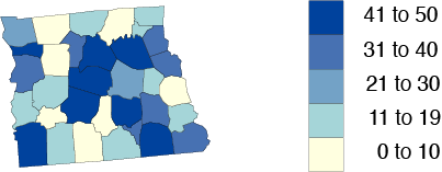
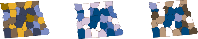
# Sequential
If the data is numerical or have categories that can be ranked it makes sense to use sequential color schemes. A change in lightness of a hue creates such a scheme (single hue) und is best suitable for unipolar data, i.e. data with no natural dividing point and progress from low to high. Varying the hue and creating multi-hue color scheme can further improve ledgibility and emphasize as it gives a better color contrast.
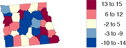
# Diverging
Furthermore, if the rankable data has provides a neutral mid-point such as negative/neutral/positive, two single-hue color schemes can be merged at the hue with the most lightness to create a comparison between the bipolar values.
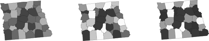
# Color Vision Deficiency
It is almost always mentioned in literature and important to remember that there could be users that have a color vision deficiency, also called color blindness. “Approximately 4 percent of the population has some degree of color vision impairment (approximately 8 percent of men and less than 1 percent of women).” (Brewer 2016, p.169).
Color vision deficiency describes the inability to see certain colors or color differences, the rarest form being only able to see black and white, the most common one being red-green deficiency. In-between is the blueyellow deficiency located, where no distinguishing between these two colors can be made. Hence, there are colors that should never be combined.
TIP
Brewer (2016, p.169) also recommends color pairings that can be used regarding most common color vision impairments and further proposes a diagram of colors combined with confusion lines to determine color pairings that are sufficient for color blind people: red/blue, red/purple, orange/blue, orange/purple, brown/blue, brown/purple, yellow/blue, yellow/purple, yellow/gray, blue/gray
Most troublesome colors however, seem to be pure reds and greens as they are not detectable from another for people with red-green vision. Therefore, colors should be tinted with some amount of blue or yellow to avoid this problem. It is advisable to either start with a color palette that is visible to the whole audience or to check the map after finishing with a tool / plugin to revise the coloring.
TIP
Color Oracle (opens new window) = free colour blindness simulator, that shows relevant colours in real-time (Windows, macOS, Linux)
Coblis (opens new window) = Color Blindness Simulator is a useful tool to upload rendered pictures, simulate deficiencies and investigate differences with a lens tool.
QGIS includes a simulation plugin found in View > Preview Mode > Simulate color blindness …
Vischeck (opens new window) is a simulator for color blind vision.
# Example
Original
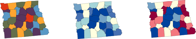
Protonomaly (red-weak)
Deuteranopia (green-weak)
Monochromacy
# Useful tools
Colorbrewer 2 (opens new window)
Probably one of the most used color scheme generator used by cartographers is Colorbrewer. It is possible to pick schemes in single or multi hue for sequential, diverging and qualitative data and even provides color schemes that support ledgibility for user with vision deficiencies.
Bivariate Color Matrix (opens new window)
By picking two colors a bivariate color palette is generated for choropleth mapping, giving an indication about differentation with a minimum Delta E variable.
Adobe Color (opens new window)
Adobe's online tool to create and explore palettes of color.
Color picker for data (opens new window)
After picking a color a scheme is generated, which is also aimed for choropleth mapping.
Chroma.js Color Palette Helper (opens new window)
By selecting what kind of color scheme is wanted (diverging, sequential) and providing at least two colors a multi-hued color scale is generated for visualizing data.
VIZ PALETTE (opens new window)
To see the effect a color scheme can have in combination with background color and font color VIZ PALETTE provides a platform to test out your newly found color schemes.
Color Scheme Generator (opens new window)
Providing a HEX color related colors are generated.
Colorleap (opens new window)
Based on historical paintings color palettes are created that describe them.
Paletton (opens new window)
Create color combinations and palettes that work well together.
ColourLovers (opens new window)
A community, that share colors, palettes and patters.
# Color Palettes Collection
A collection of usable color palettes on maps are found here
# References
- Axis Maps. Using Colors on Maps (opens new window) (accessed 15 Aug 2019).
- Atzl, C., 2016. How to design web maps that users like?. In: Online-Karten im Fokus - Praxisorientierte Entwicklung und Umsetzung. Berlin/Offenbach: Wichmann, pp. 40-44.
- Brewer, C. A., 2016. Designing better maps - A guide for GIS users. 2nd Edition ed. Redlands: Esri Press.
- Dent, B. D., Torguson, J. S. & Hodler, T. W., 2009. Cartography - Thematic Map Design. 6th Edition ed. New York: McGraw-Hill.
- Krygier, J. & Wood, D., 2016. Making Maps - A visual Guide to Map Design for GIS. 3rd Edition ed. s.l.:Guilford Publications.
- Muehlenhaus, I., 2014. Web Cartography. Boca Raton: CRC Press.
- Peterson, G. N., 2015. GIS Cartography. 2nd Edition ed. Boca Raton: CRC Press.
- Robinson, A. H. et al., 1995. Elements of Cartography. 6th Edition ed. New York: John Wiley & Sons, Inc..
- Smith, Richard. Map Symbols and Visual Variables (opens new window). (accessed 15 Aug 2019).
- Tyner, J. A., 2010. Principles of Map Design. New York: Guilford Press.